
Colour doesn’t have to be hard work:
We'll help you make confident choices in your renovation.
When it comes to renovating, nothing creates more hesitation than choosing colour, especially in permanent fixtures like tiles. We often hear people say, “I just want to play it safe” or “I’m worried I’ll get sick of it.” But here’s the good news: colour doesn’t have to be scary. In fact, with the right approach, it can elevate your space, reflect your personality, and add timeless character to your home.
At Walkers Design Centre, we help clients every day take the fear out of colour. Whether it’s bold or subtle, colour is about balance, not bravery. Here’s how to embrace it with confidence—especially when it comes to your tile choices.
What's trending in tiles right now?
Colour is back, but it's more refined than ever.


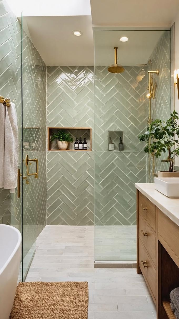
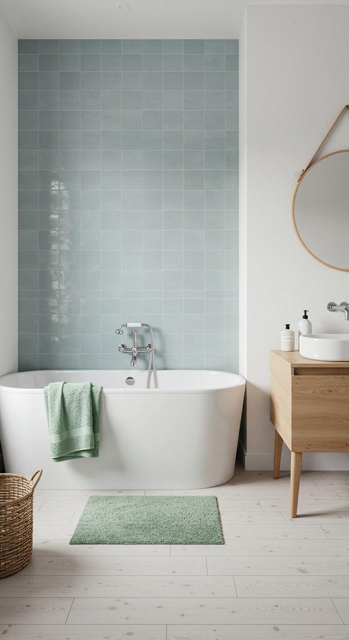
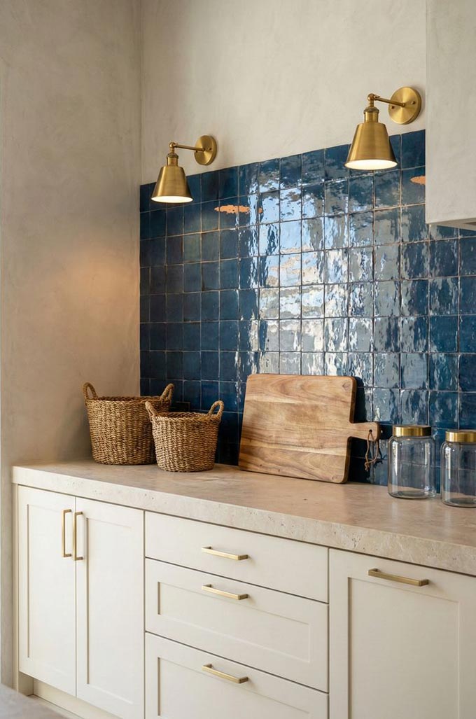
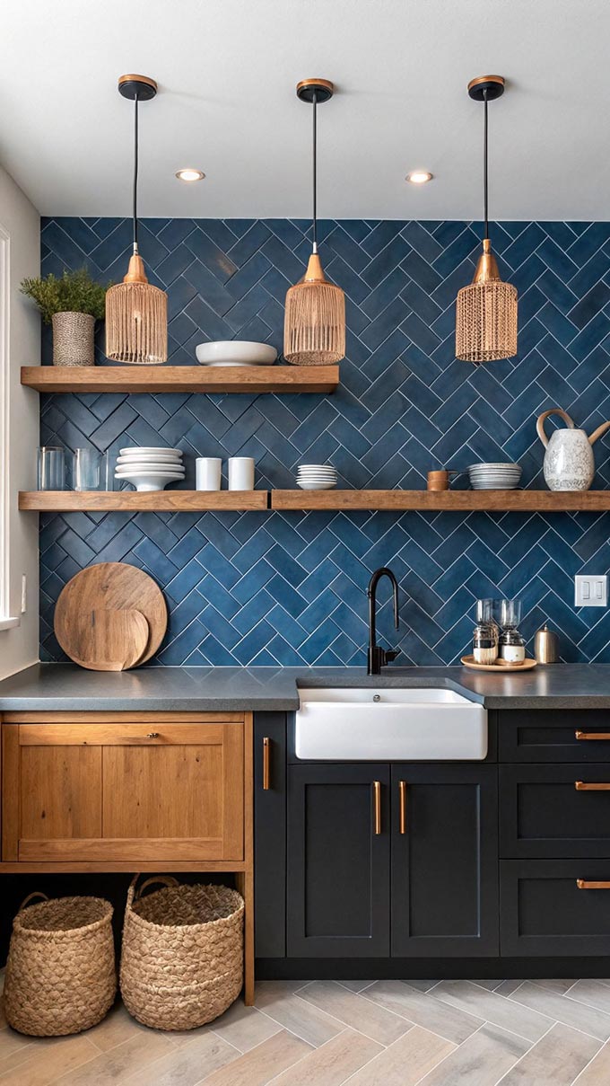
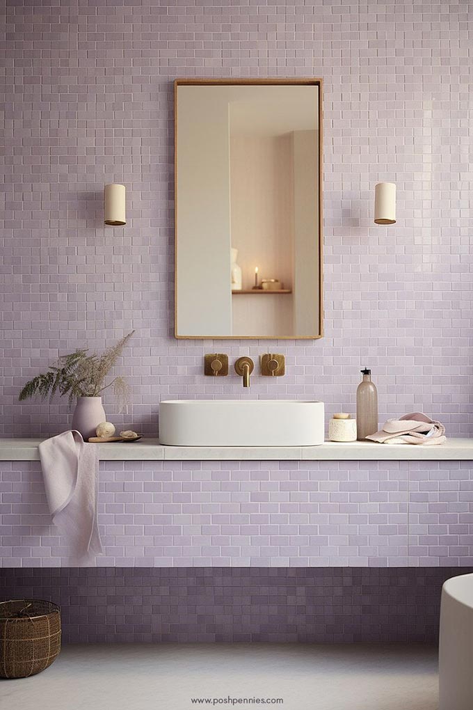
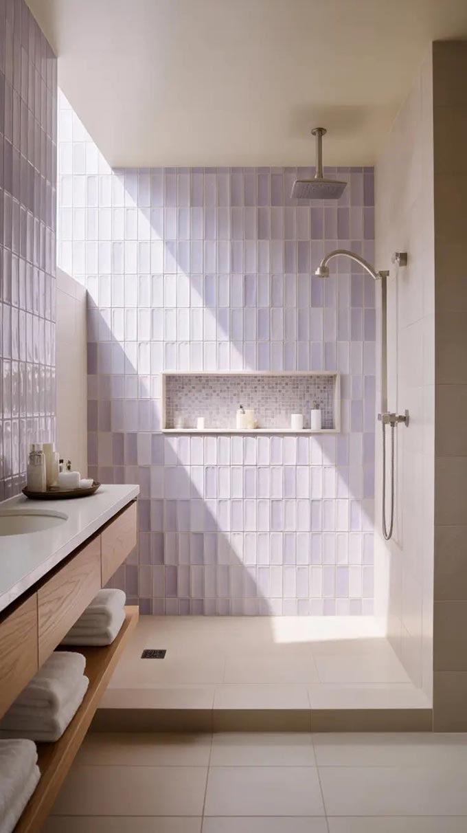
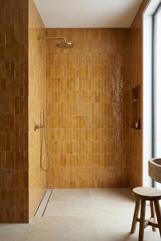
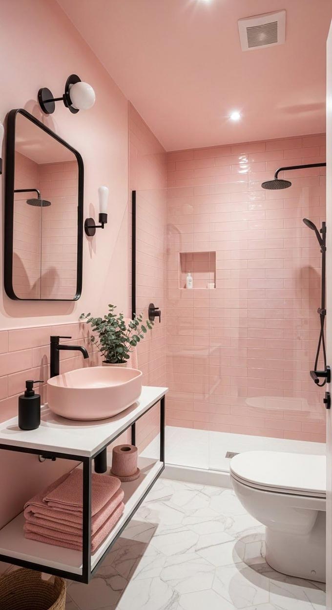
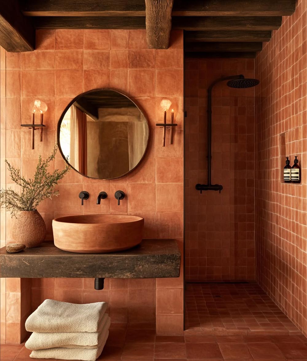
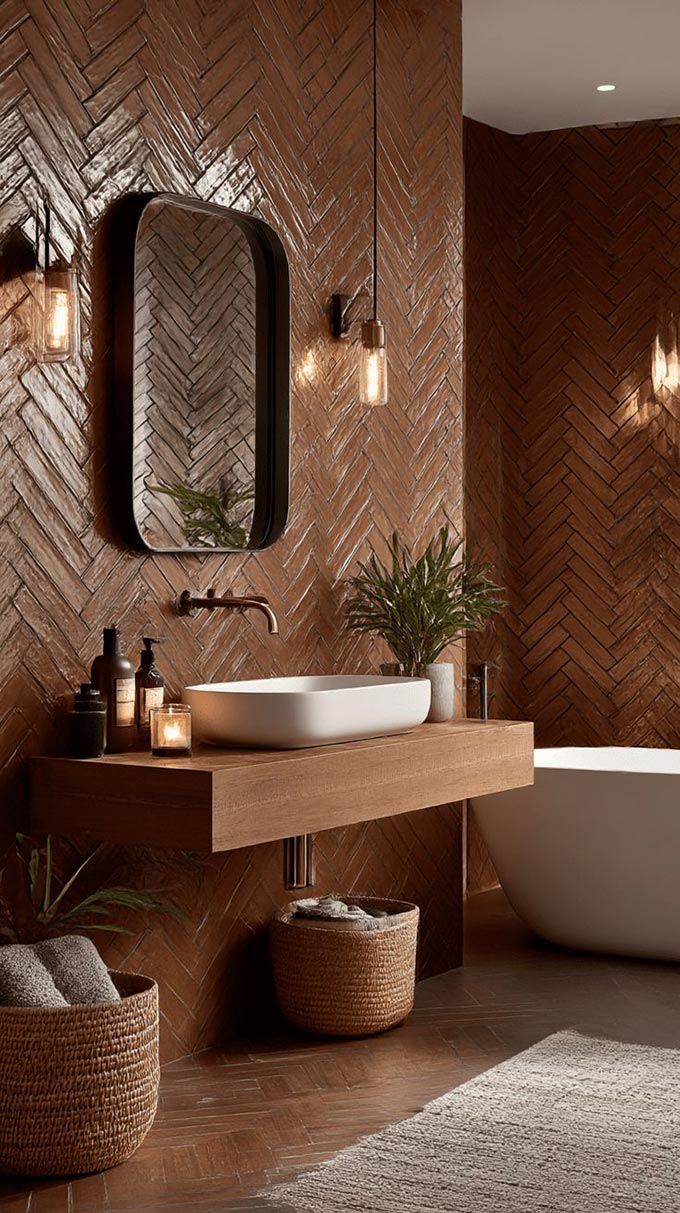
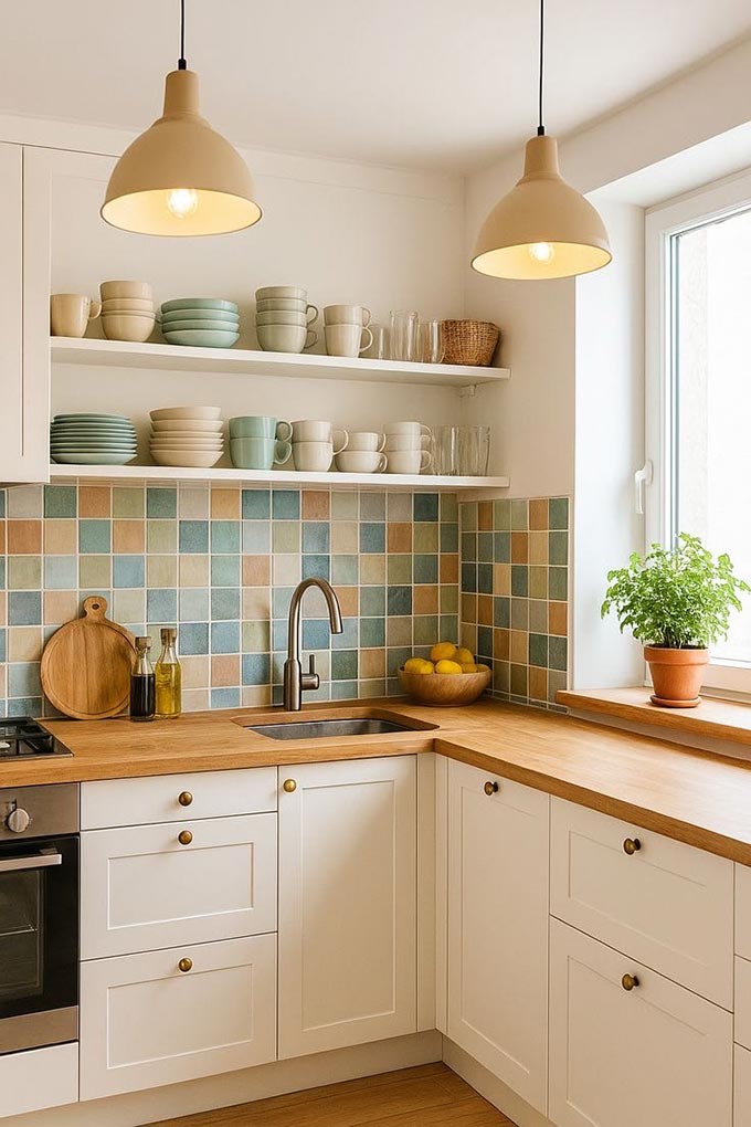
Feature Colour vs. Full Saturation: How bold do you go?
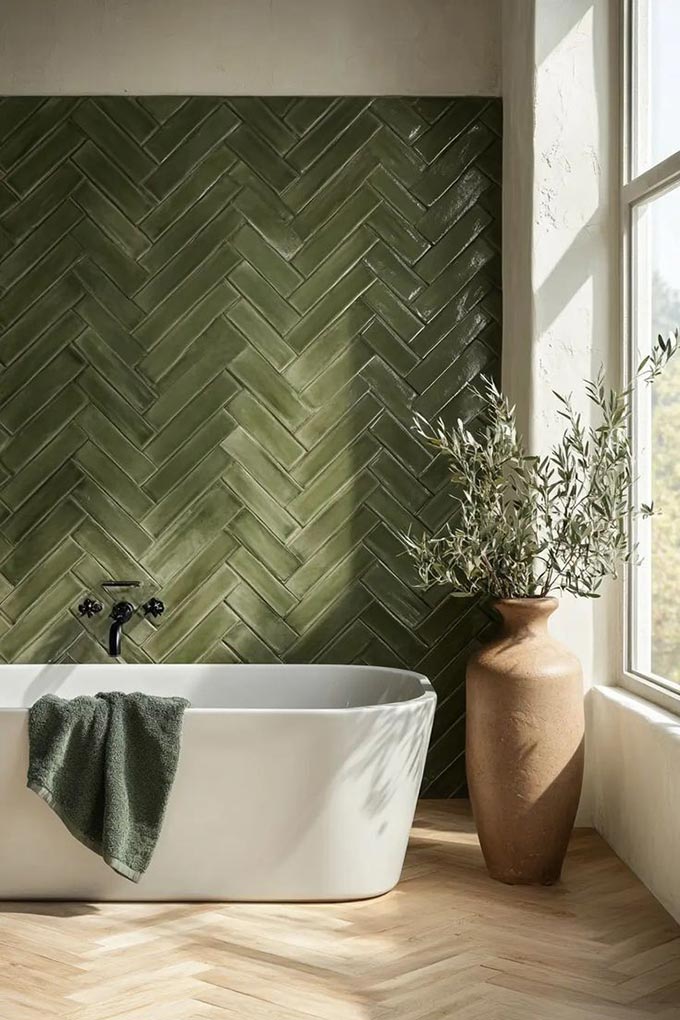
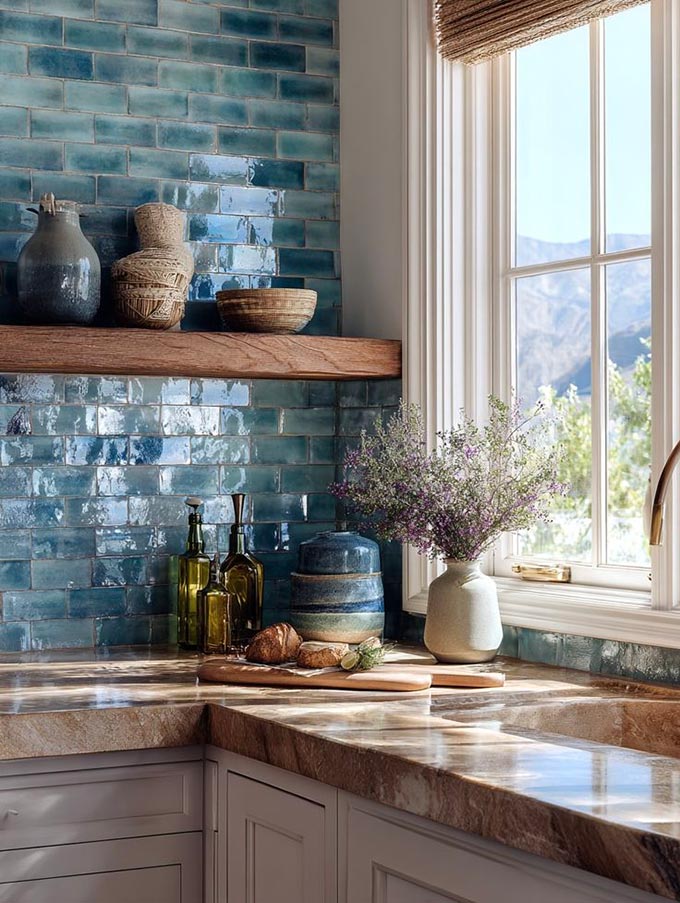
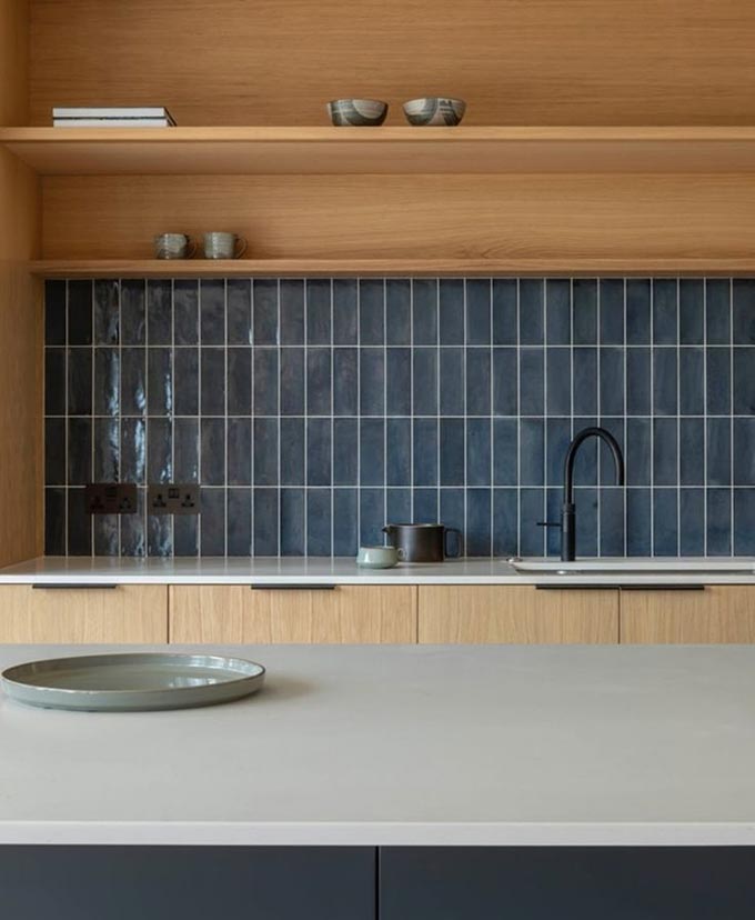
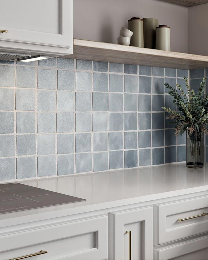
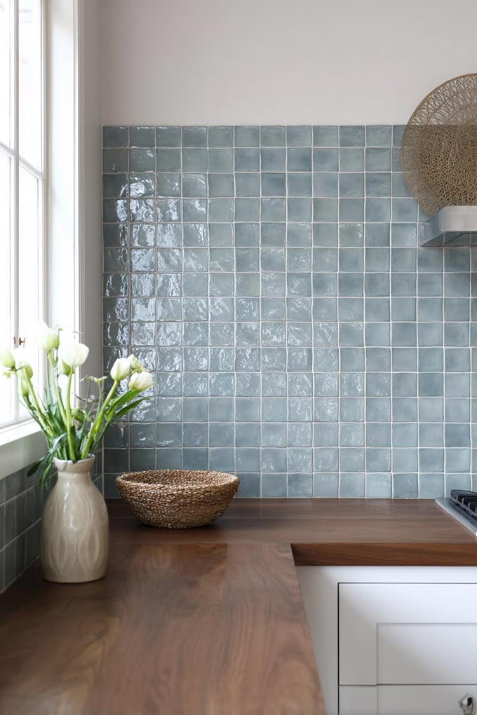
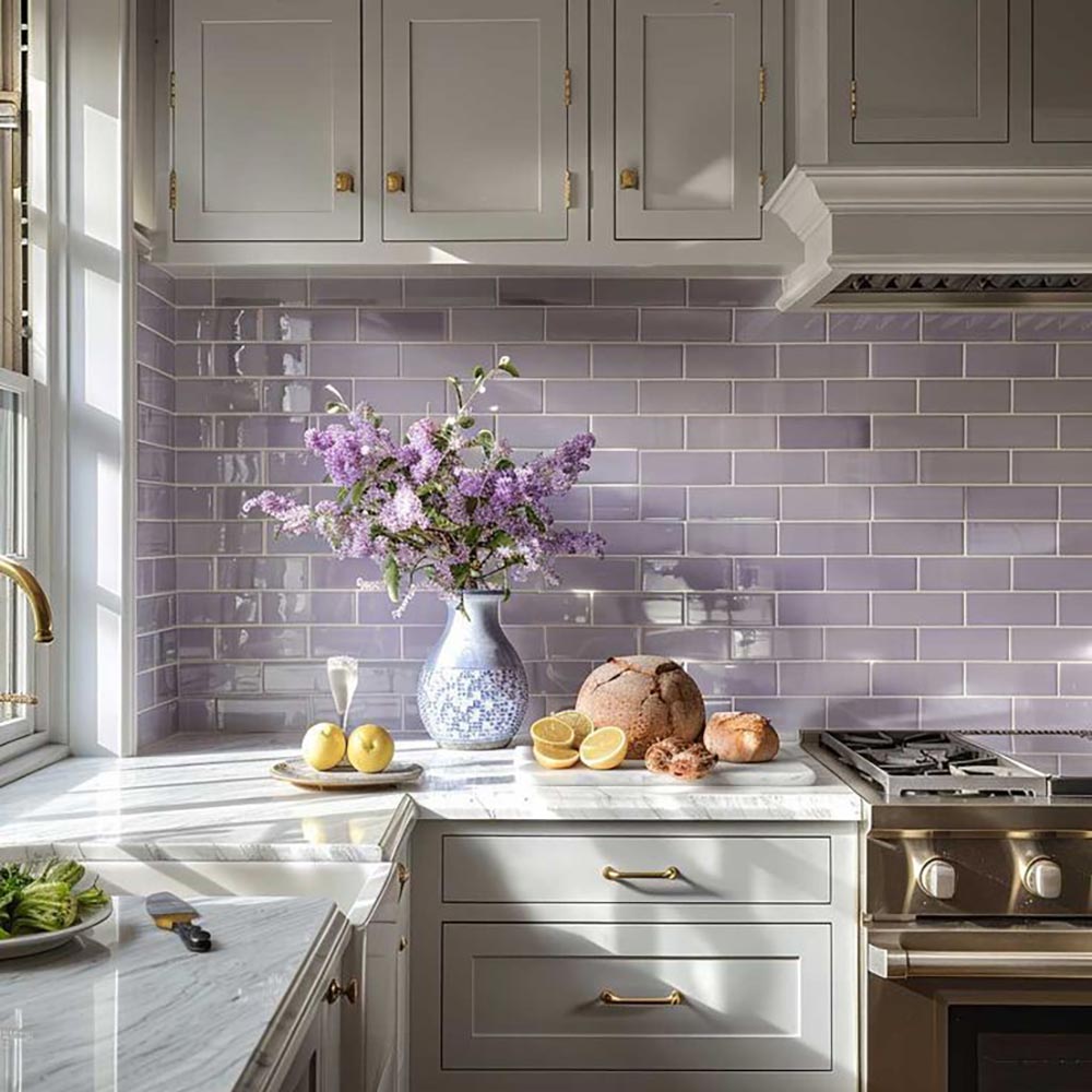
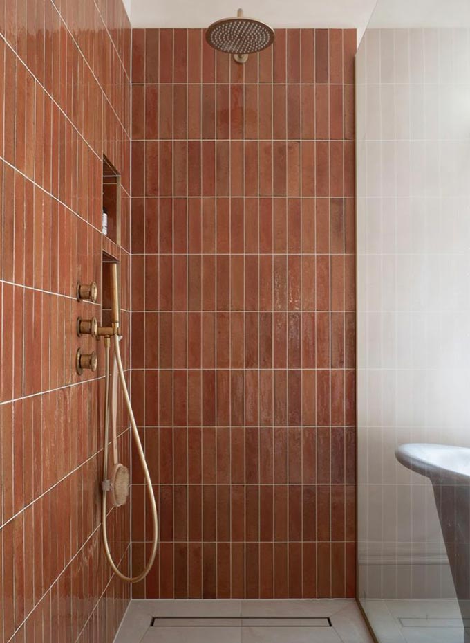
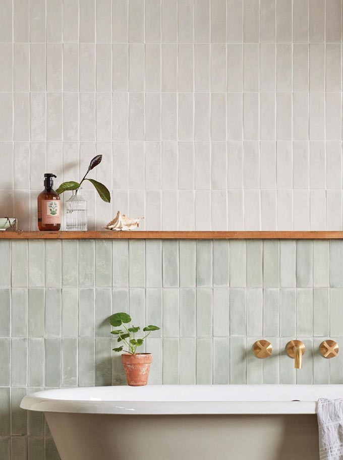
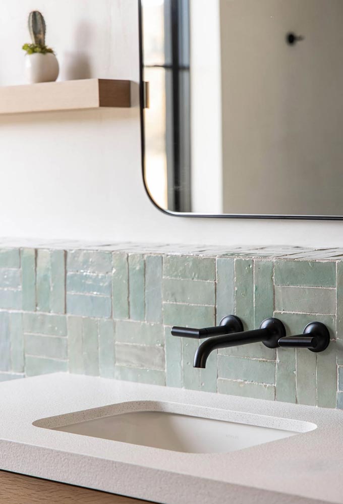
Feature Colour
Using colour as a feature, like a splashback, niche, or shower wall, is a great way to introduce personality without overpowering the space.
- Great for those testing the waters
- Easy to style around
- Creates a focal point without commitment to full saturation
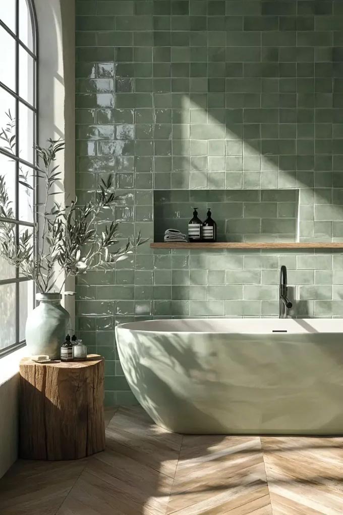
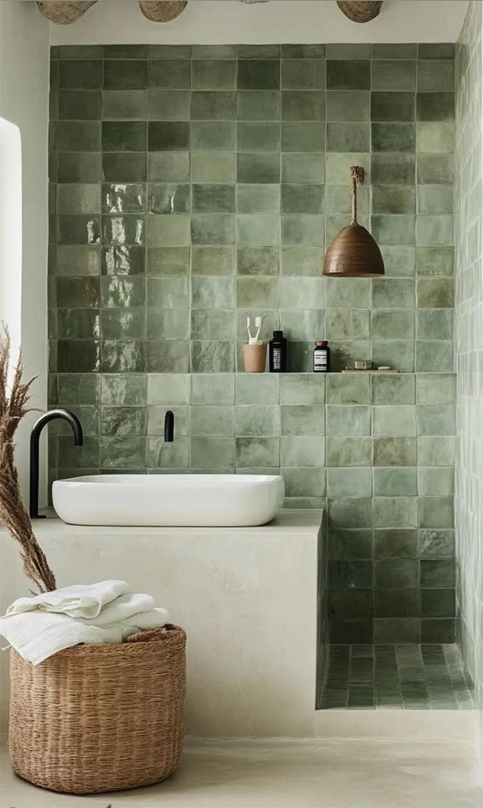
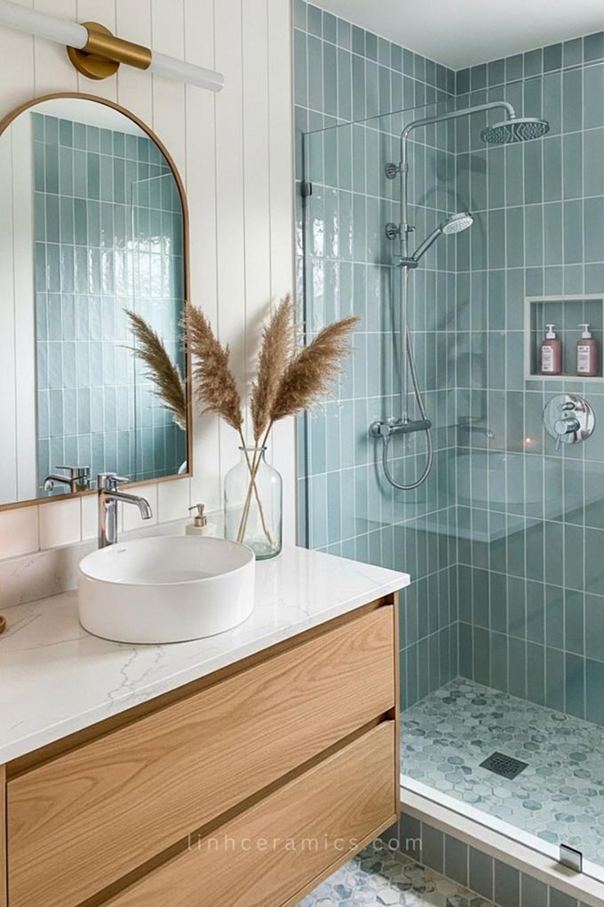
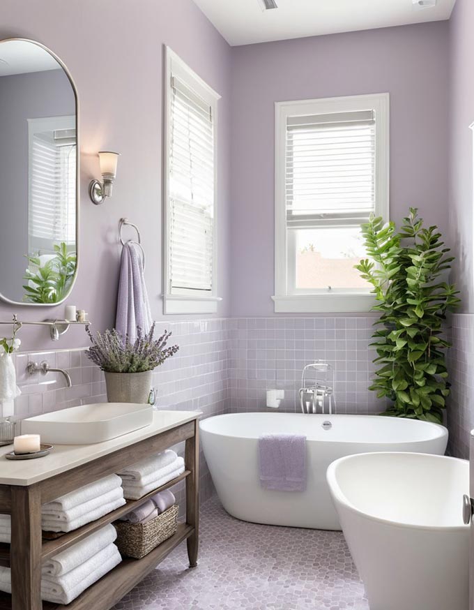
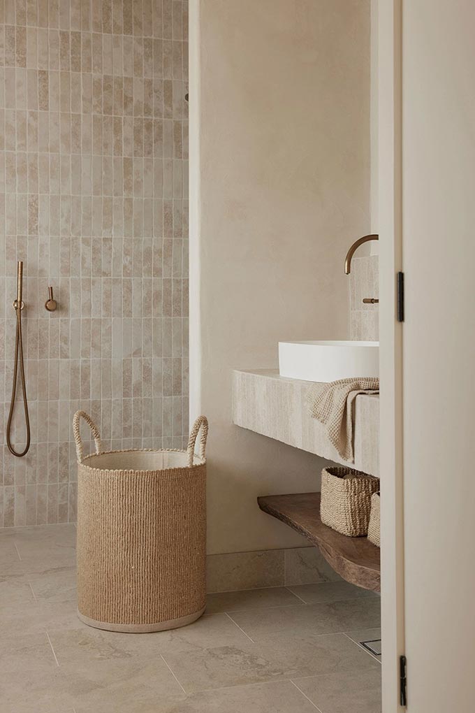
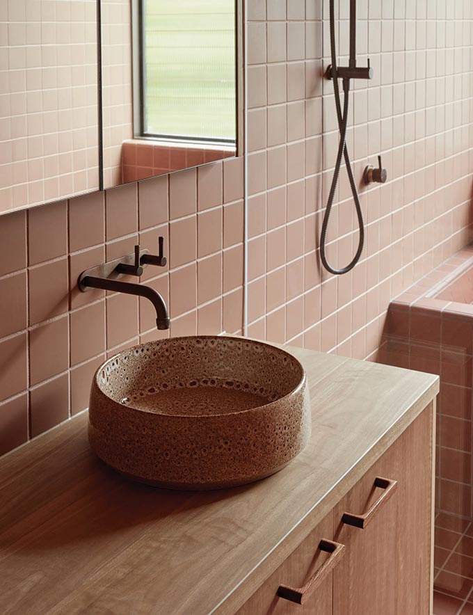
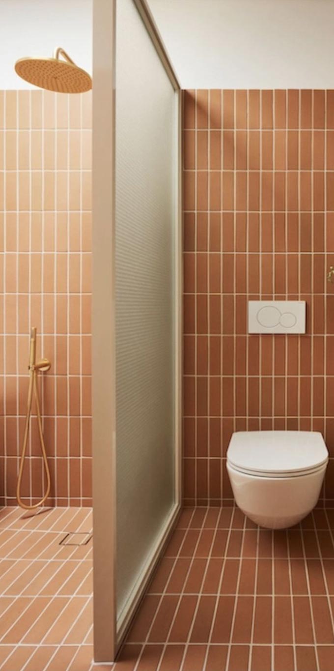
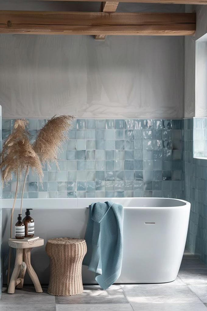
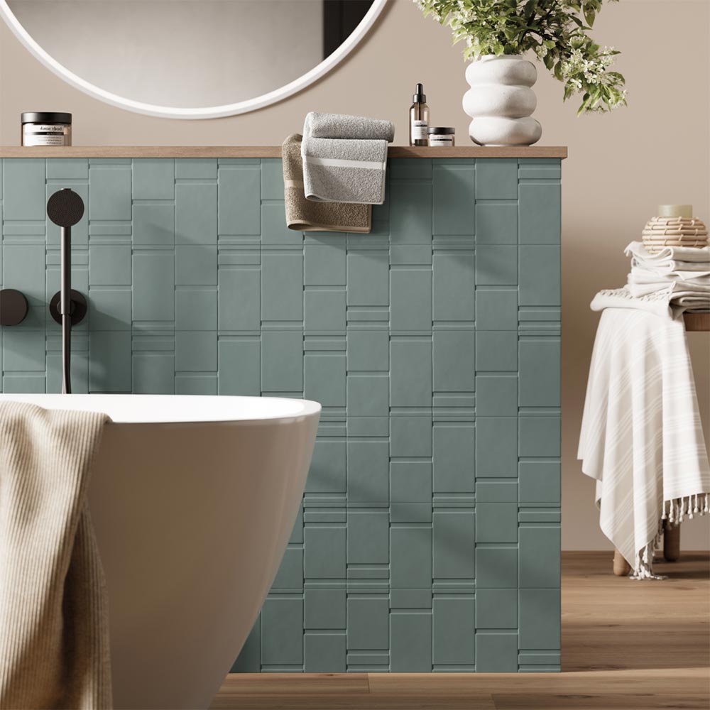
Full Colour Saturation
Going all-in with colour, on all walls or floors, can create a truly immersive space. This works beautifully in small bathrooms or powder rooms, especially when paired with bold styling or contrast trims.
- Dramatic and designer-like
- Best when well-planned with consistent styling
- Ideal for confident renovators or those working with a designer
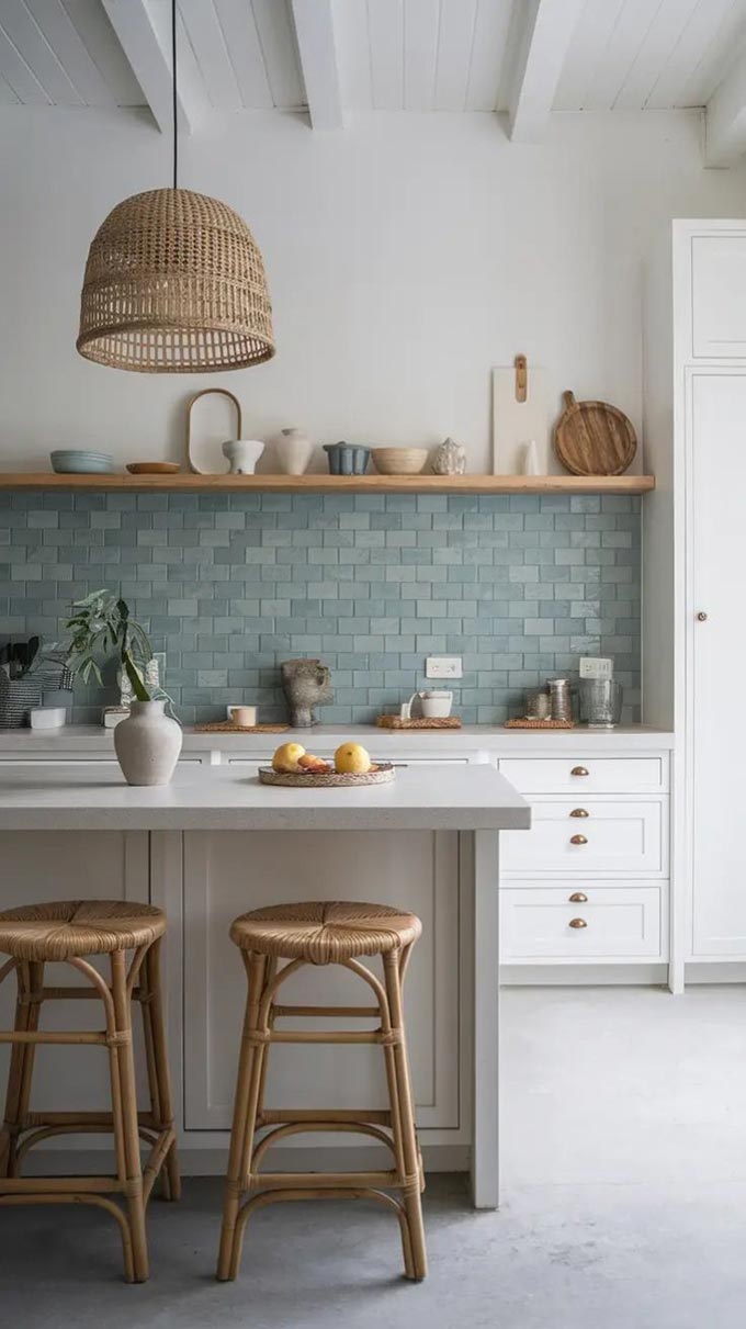
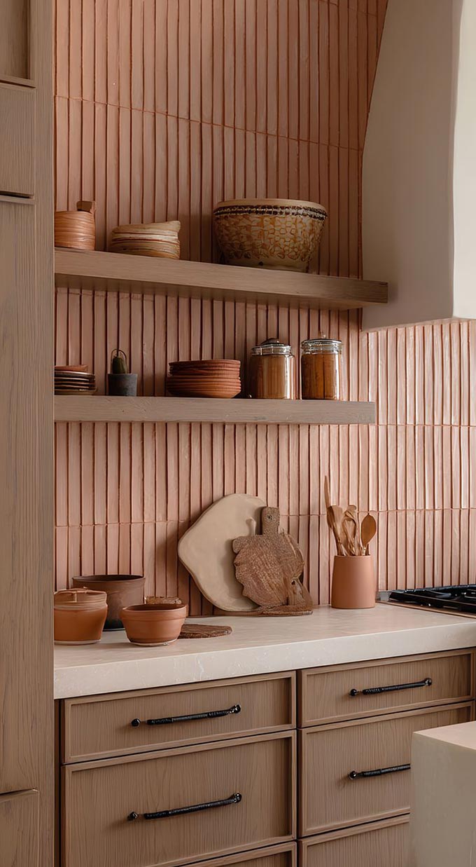
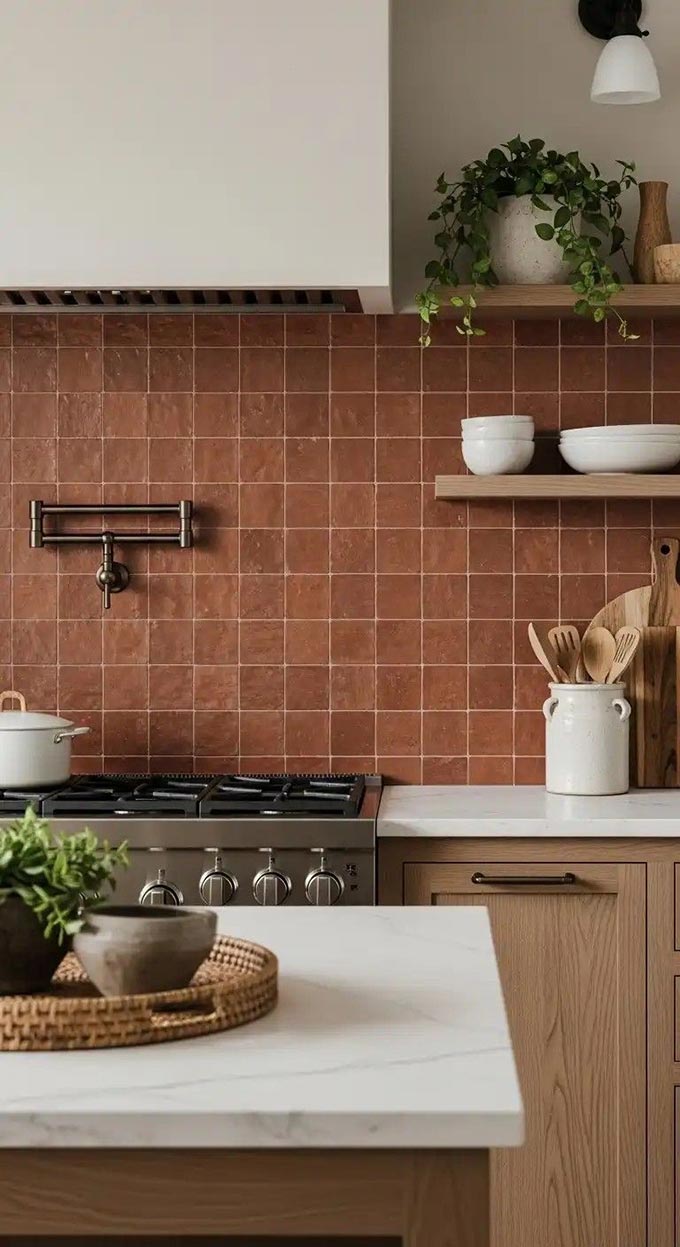
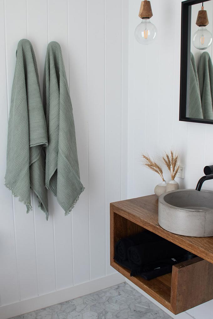
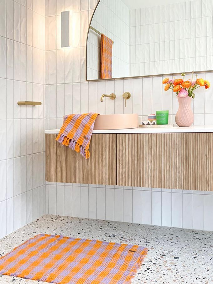
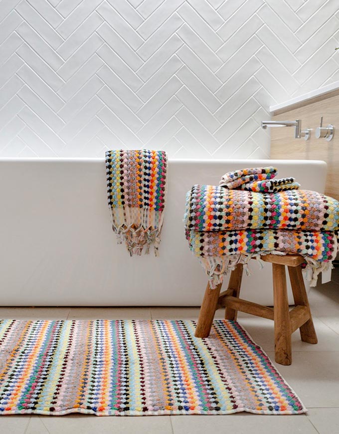
Pops of colour through styling
Still nervous about committing to colourful tiles or paint? No problem. You can bring personality and flair into your space through easily changeable styling elements, making colour both flexible and fun.
Here are a few ways to do it:


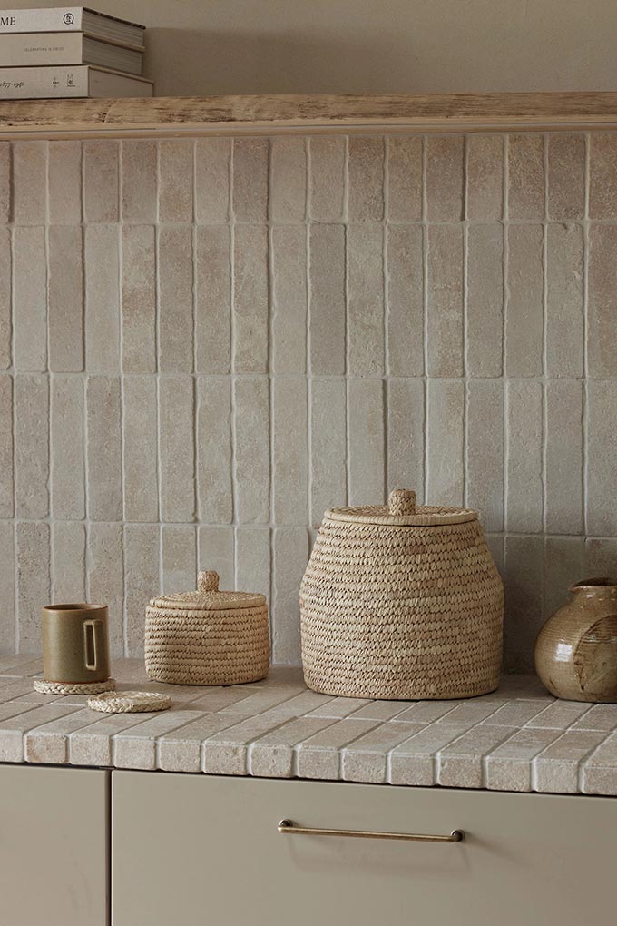
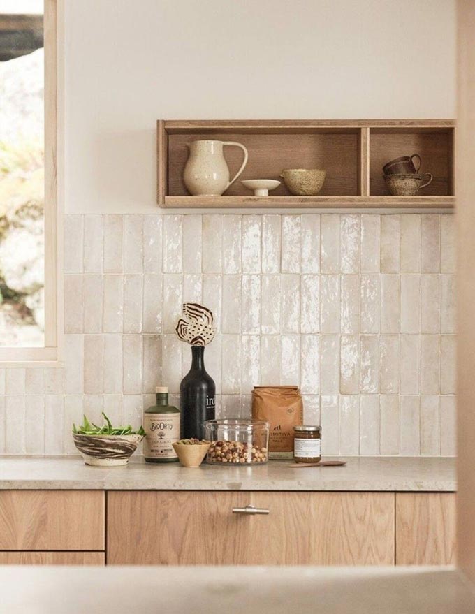
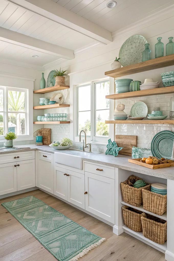
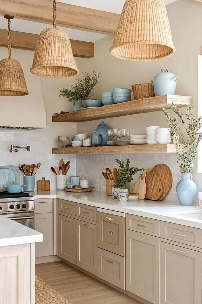
Kitchen Styling Ideas
Bring in colour through small appliances like kettles, toasters, mixers, or even coffee machines. Use coloured ceramics, glassware, or open-shelf décor to tie in your accent tones. Swap out bar stools or pendant lights in a bold finish for high-impact styling without full commitment.
The best part? These additions can be updated over time as your tastes evolve—so you still get your colour fix without the pressure of permanence.
Tips for Choosing Colour with Confidence

- Start with what you love, not what’s trendy
If you’ve always loved green or navy or soft blush, that’s your anchor. Trends come and go—personal connection is timeless. - Use samples in your home’s natural light
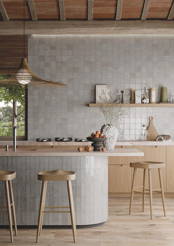
Colours can shift dramatically depending on the light. Always test tile samples in the space they’ll be installed. - Pair colour with texture
Coloured tiles with a glazed, handmade, or textured surface add depth and interest, making even subtle colours feel more dynamic. - Keep the palette simple
If you’re using colour in tiles, balance it with neutral cabinetry, stone, or flooring. Three key materials or tones is usually a good rule of thumb. - Use grout to your advantage
Want the tile colour to stand out? Use a contrasting grout. Want it to blend? Match it. It makes a big visual difference.
The bottom line: colour is an expression, not a risk.
Colour doesn’t mean chaos. It can be quiet and tonal, or bold and bright—it’s about reflecting how you want to feel in your space. With expert advice, great samples, and a clear vision, colour becomes your best design tool—not something to fear.

